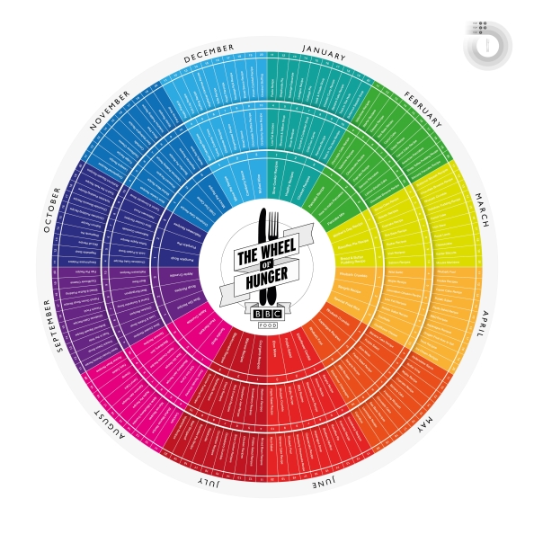
The wheel of hunger

(click image to enlarge)

Big thanks to Adam Hinks for his help in making this data look magnificent and to James Webb for his invaluable feedback and direction.  Want to see other ways search engine data can be made awesome?

Background

Our brains process 400 billion bits of information every second

Sounds like a lot doesn’t it?  Well it is, but fortunately we only ‘experience’ around 2,000 bits of this

This filtering enables us as human beings to make decisions based upon the data we receive. Without it, we’d be paralysed by the overwhelming possibilities of everything we see, touch, hear, store, smell and sense

In much the same way, when we look at what people are searching for online, it’s easy to be overwhelmed by rows upon rows of search terms, dates and volumes (even if it ‘only’ amounts to less than a million rows)

For someone looking at the data all day with advanced spreadsheet skills and tools it can be a little easier but we can’t all be data ninja’s and nor would we want to be

That’s why the visualisation above was created.  It takes a mass of data around what people search for online and filters it down through stages in order to answer the important question for anyone interested in creating content around food ‘what should we be talking about / linking to / sharing / discussing / creating / revamping?’

The filter process:

What people search for

(look at a big dataset of search terms that send traffic to over 3,000 recipe websites, in this case Hitwise)

What (UK) people search for around food

(restrict data to only those searches that ended up visiting a food related website)

What (UK) people search for around food every month

(Download the data on a month by month basis)

The most trending searches around food every month

(Compare this each months data to the previous months data and chart those searches that have risen the most in volume.  This is to make sure that we’re looking at search terms that are ‘big’ due to the month and not just those that are ‘big’ all year round).

What’s the point?

In creating this visualisation we’ve hopefully made something that helps us better connect to our audiences.

As every marketer knows, messages need to be delivered to the right people at the right time in the right place, using their language.  In refining it to just the top twenty trending search terms for each month we’ve hopefully made something that will not just make sense but will be used to make a difference.

Big thanks to Adam Hinks for his help in making this data look magnificent and to James Webb for his invaluable feedback and direction.

You can download the infographic in PDF format here BBC_Food_Infographic_v5

Most other search visualisations from this site are here

Please take a while to comment below.

29 responses to “The wheel of hunger”

  1. Shouldn’t this be The Plate of Hunger?

    1. Or how about the ‘wagon wheel of hunger’?

    2. None can doubt the verticay of this article.

  2. Good job y’all – there’s a lot of really impressive work here. PS “The Wheel of Hungover” would be an excellent follow-up piece

    1. Wheel of hungover, alcoholic searches throughout the year. I love it! Added to my things to blog about list.

  3. […] Search Ideas […]

  4. […] by the wheel of hunger visualisation from the other week I started to look into food trends around the world with the […]

  5. Looks pretty….shame he can’t spell ROAST (December)

    1. The spellings are taken directly from internet searches – The UK can’t spell roast!

  6. This is interesting. But could another take on helping marketers target audiences be that it results in less choice?

    1. I’d agree to a point however the searches are often so generic (mothers day recipes) that there’s a vast range of angles and content that could be made around that. The purpose of the wheel is really to be an entry point into a large amount of data that sits underneath. By making it look attractive and tell one story, you get people interested in the data and therefore interested in what their audiences want and when.

  7. I am absolutely intrigued! I’ve been food blogging for about a year now and am always curious about the searches that lead people to my site. One of the biggest hits I got was because I had posted something about making your own mead and a friend had illustrated it with a diagram on how yeast and sugar is converted to alcohol . . . I was getting hundreds of hits for American high school students looking for an alcohol fermentation diagram!

    1. Odd what people search for isn’t it? This blog is found regularly for ‘double entendre’ for a picture I put on it ages ago

  8. Love your blog, fantastically interesting stuff. It is awesome to know I contributed to some of those random recipe searches! =)

  9. […] The original designs can be seen on in our portfolio. There is a great write up from the talented co-producer and data-head Duncan Bloor on his blog – check it out. […]

  10. Wow this is really facinating! I’m new to blogging but already its facinating to see what people search for. I wonder how many of these searchs were followed up by the dishes. I have been known to read endless recipes at particularly ‘seasony’ times of year to get me in the summery/autumnal/christmassy mood.

  11. Also, I think this would make a great poster!! I don’t suppose that’s in the pipeline…

    1. Thanks, it was made for BBC Food, for internal use really so no poster in the pipeline however you could download it as a high quality PDF (link at the bottom of the post ) and take it to a printer?

  12. […] imagine my delight this morning to find something to unite the two interests, courtesy of Search Insights. Bring on ‘The Wheel of […]

  13. […] astounding diversity. This week we’re looking at people’s search habits, starting withthe graphic above conceived by Duncan Bloor and designed by Adam Hinks. It’s called the Wheel of Hunger, and it shows the 20 most common […]

  14. i love your blog duncan!!!

  15. […] methodology here. Share this:TwitterFacebookLike this:LikeBe the first to like this post. Tagged BBC Food, Search […]

  16. Thanks for sharing the wheel of hunger. It’s very vibrant and colorful. How did you get the data by the way?

  17. […] More recently smart research which demonstrates what content marketing really is has been done, researching when and how people look for content – I have seen more recent examples where an agency has taken a specific sport to look deeper into this. – the hunger wheel represents a clear and intelligent content strategy. https://searchinsights.wordpress.com/2011/09/28/the-wheel-of-hunger/  […]

  18. Would there be a mobile phone number by any chance that
    people can get to contact the owner of this post?

  19. I am not sure where you’re getting your info, but good topic.
    I needs to spend some time learning more or understanding more.
    Thanks for great information I was looking for this info for
    my mission.

  20. Howdy this is kind of of off topic but I was wanting to
    know if blogs use WYSIWYG editors or if you have to manually code with HTML.
    I’m starting a blog soon but have no coding experience
    so I wanted to get guidance from someone with experience.
    Any help would be greatly appreciated!

Leave a comment